ART NEWS
Typographers, unite! Have you designed for #36DaysOfType yet?
The annual 36 Days Of Type movement is back. We speak with the studio that started the global design challenge and how it makes you look at your ABCs in a whole new way
For many, font is everything; it changes the way a document looks and some can argue that it conveys the personal experiences, experimental approaches and even energy or mood of the writer. Curlz TM and Comic Sans are very millennial and often mocked, Tahoma and Verdana have minimalist and futuristic feels, while script fonts are all about elegance. Typography has become a vital resource for brands and writers alike, and has evolved into a serious design sub-culture. The 36 Days Of Type design challenge sees artists around the world putting pen to paper, brush to canvas, stylus to tablet to infuse the biggest personalities into the 36 — not 26 — single letters of the Latin alphabet. The 2021 edition kicked off on April 5.
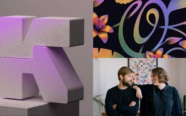
Nina Sans and Rafa Goicoechea, a couple of graphic designers in Barcelona, founded this project in 2014, ignited by formal studies into the subject. Even through an email interview, the duo’s obsession with typography is evident. Goicoechea is so into typography, he pursued an MA in Advanced Typography at Escola de Disseny i Art, Barcelona, in 2012, but both partners formally studied graphic design. “That led us to the creation of this project. “A couple of years ago, we founded our graphic design studio, Treintayseis, which translates to ‘Thirty-six’, to put together both our work behind 36DOT and our studio projects,” says Goicoechea.They love how the rest of the world has shown fascination with it too, and the thousands of posts and comments prove it. Just search #36DaysOfType on Instagram and a rough count of a million posts come up, each one vibrant and sporting a trademark style to the artist. “As the project has grown bigger and the audience has reached more countries, we have noticed how far the interest in typography is present in the whole world not only for graphic designers, but for a wider public. Taking the fact that our project is only based in the Latin alphabet, we are surprised by how far this interest has grown in countries with different scripts, to the point we have received requests through the years to make side projects for other languages and scripts,” says Sans.India’s artists have been active participants. Goicoechea explains, “It is interesting to see how much the project has grown in India in the last few years, and how diverse the entries are, especially in fields like illustration, crafts or 3D. If we had to name a few interesting artists [on Instagram] taking part, those that come to mind would be @muhammedsajid.n, @anupreeta_, @rutujamali, @vatash, @cognisant, @anu_mnhr, @___riyamahajan, @pragunagarwal or @khyatitrehan.”Around the pandemicWith the thousands of entries flooding in daily, one has to imagine the team overseeing the submissions has to be sizable but Sans responds, “Even if it sounds hard to believe, the team is the two of us. We are responsible for all the communication, pre-launch preparations, design, management and curation of every edition. That could explain a bit of the level of stress and lack of time we experience within the 36 days of each edition. However, our tastes differ as well as our personality, so if we put that together, it makes us a versatile team.”
The letter ‘M’ (by Hazel Karkaria) and ‘C’ (by Cyla Costa) for 36 Days Of Type challenge
| Photo Credit:
Instagram
Goicoechea explains that people were looking forward to the new edition this year, and the duo also noticed a stronger sense of community. He recalls, “Last year the project had already started when we suddenly found ourselves in the middle of the COVID-19 pandemic, and it was a great relief, and helped many to not feel so isolated. It was also a blessed distraction for many of us that were taking part. The pandemic is still here, so this has played an important role in this kind of mood.” Were there any COVID -themed submissions? Sans and Goicoechea have certainly spotted some but not as many as expected, “There are a few series going on around Coronavirus this year, but they are all in a serious tone or trying to educate in good practices. Last year, there were lots of jokes around it, since it was new and no one knew how far and big this was, but this year, it looks like people are taking the theme more seriously or prefer to focus on themes that have nothing to do with it.”Artist awarenessThe 36 Days Of Type challenge reminds people to not underestimate or undervalue the skills of graphic designers. Sans and Goicoechea comment, “Unfortunately, we think there is still much to be done in this path. Both clients, companies and also some artists need to be more educated in how to value the work and the services they offer or request. We don’t know if this will bring awareness or the opposite, but we hope that at least the project helps individuals to improve their skills and self-value to empower them somehow to fight against this kind of practices.”Historical significanceThe project has been a special keyhole through which the rest of the world can embrace the beauty of type, and Goicoechea agrees. “We do believe typography has a key role in history, as a faithful reflection of each era. The history of typography is somehow the history of human development, so there is much to be told through this discipline. Its roots go start at the earliest and now it reflects the fast-moving and mutating times we live in. We are not surprised that organisations like museums are interested in getting involved.”There is an academic aspect to 36 Days Of Type. Sans comments, “Of course, people are showing how a good letter should be done, and there’s also a lot to learn from each other — from fundamentals to techniques, to awareness about things happening in the world, or the thousand of different perspectives you can find to draw the same letters.”At the end of the day, Sans and Goicoechea just want people to have fun with it. “We think that the project is not so much about the fundamentals of typography, since the core is more experimental and playful than that. In the end, many of the players take the letterform as a canvas to express many other things, and that’s part of the beauty of the project — almost everyone can take the challenge and make a personal approach to designing an alphabet.”


